The best homepage hero does not explain everything.
It makes the next decision feel safe.
That is especially true for complex B2B products. The visitor arrives with incomplete context, limited patience, and one private question: Can I trust this enough to keep going?
A strong first screen answers quickly.
It names the category. It states the outcome. It gives proof. It makes the next click obvious.
A weaker first screen may still look polished, but it expands the field of choice before the visitor knows what to do with it.
That is the difference between Stripe and Webflow.
Stripe turns complexity into trust velocity.
Webflow turns possibility into decision load.
The screens being compared
Both companies sell powerful, mature products. Both have a lot to say. Both serve teams that care about growth.
But their first screens behave differently.
The test
A homepage hero should make five things clear above the fold:
- What category the company belongs to
- What outcome the product creates
- Why the company is credible
- What the visitor should do next
- Which elements deserve attention first
If the visitor has to assemble those answers from multiple competing modules, the page is doing extra work.
That extra work matters. Homepage friction is not only visual friction. It is strategic friction. The more a visitor has to decode, the slower trust forms.
What Stripe gets right
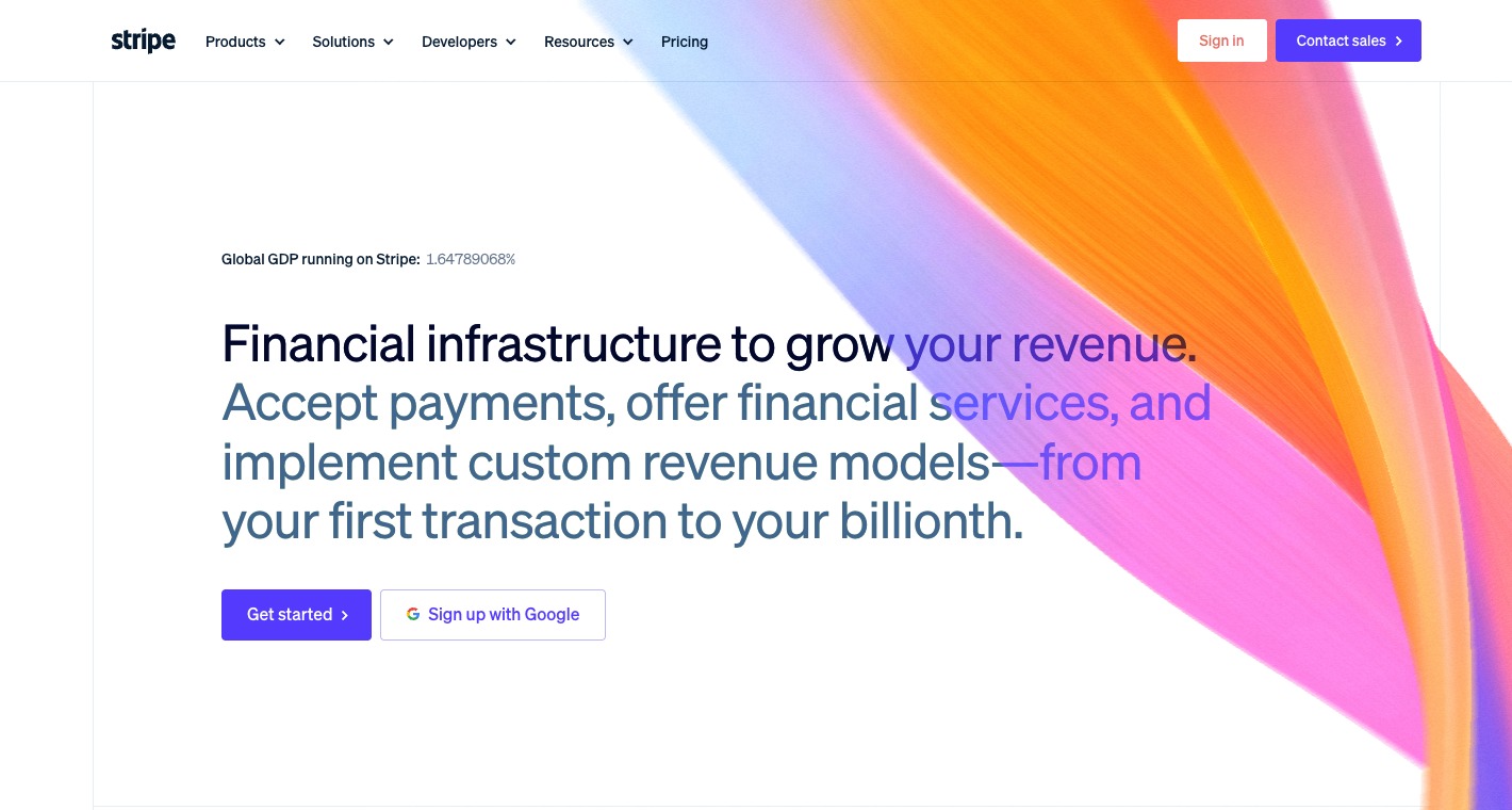
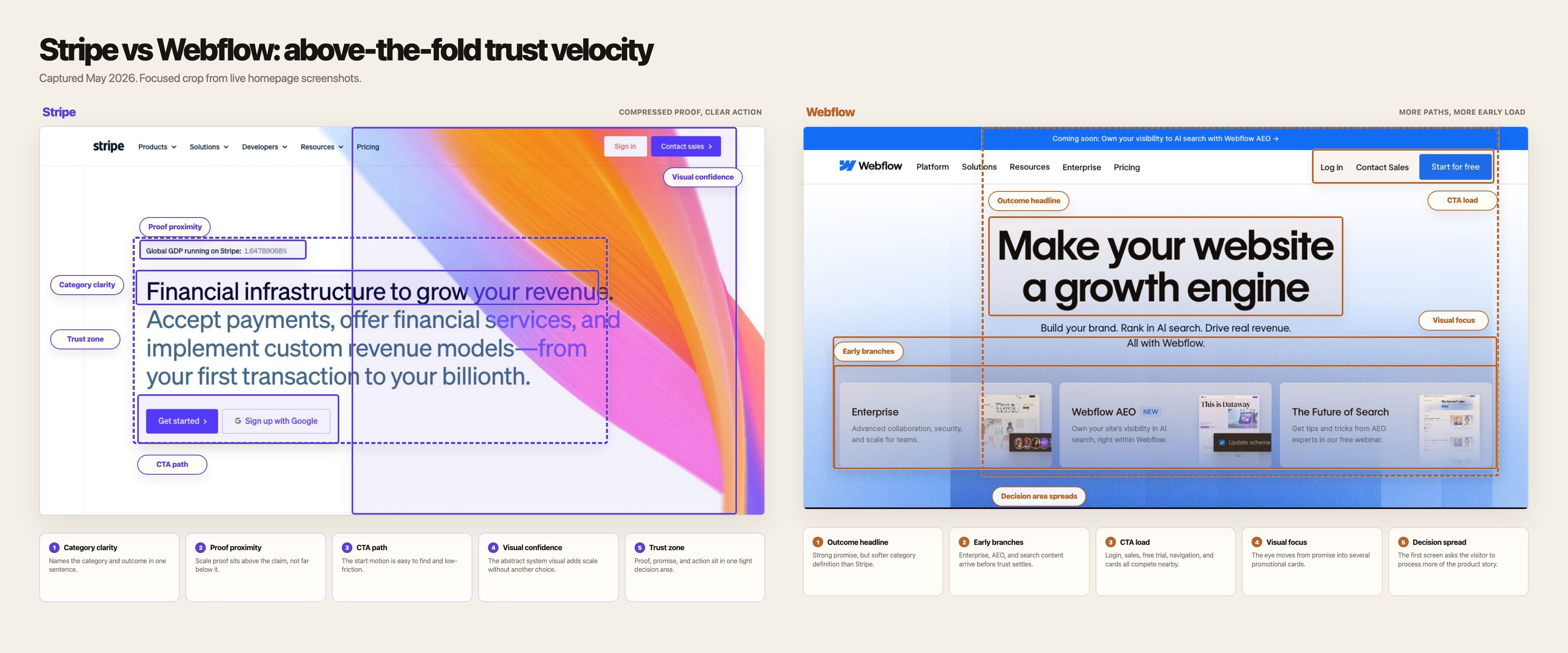
Stripe's homepage is not quiet.
It has a large abstract visual, animated-feeling color, product navigation, a metric, and multiple calls to action. The page is visually ambitious.
But the hierarchy is calm.
That distinction matters.
1. The category is named immediately
Stripe leads with: Financial infrastructure to grow your revenue.
That sentence does two jobs at once.
It names the category: financial infrastructure.
It names the outcome: revenue growth.
A visitor does not need to infer whether Stripe is a payment processor, a banking layer, a revenue platform, or a developer tool. The phrasing holds those ideas together without forcing the page to explain each one upfront.
The sentence is broad, but it is not vague.
2. The proof sits near the promise
The small GDP counter does not carry the page by itself, but it does useful work.
It tells the visitor: this is infrastructure at serious scale.
That proof appears before the visitor hits the call to action. It is not buried in a logo wall several scrolls down. It gives the promise weight while the visitor is still evaluating whether to believe it.
Proof works best when it is close to the claim it supports.
Stripe understands that.
3. The call to action path is clean
Stripe gives two obvious moves:
- Get started
- Sign up with Google
There are other navigation paths, but the primary action is not hard to find. The button does not compete with a carousel, a campaign card, a webinar, or a secondary product announcement.
The page is saying: if you are ready, start here.
That clarity reduces hesitation.
4. The visual field supports the idea without fragmenting it
The large color form is not a product screenshot. It does not teach the interface. It does not explain a workflow.
That is fine.
Its job is to create scale, motion, and confidence around the central claim. Because the copy is already specific, the visual can stay atmospheric without making the page feel empty.
This is a good use of abstraction: the visual amplifies the brand while the copy handles the argument.
5. Trust is compressed into one decision zone
Category, proof, action, and visual confidence all sit inside one tight area.
The visitor does not have to travel around the screen collecting reasons to proceed.
That is why the page feels fast.
Not visually fast. Decision-fast.
Where Webflow loses momentum
Webflow's homepage is not bad.
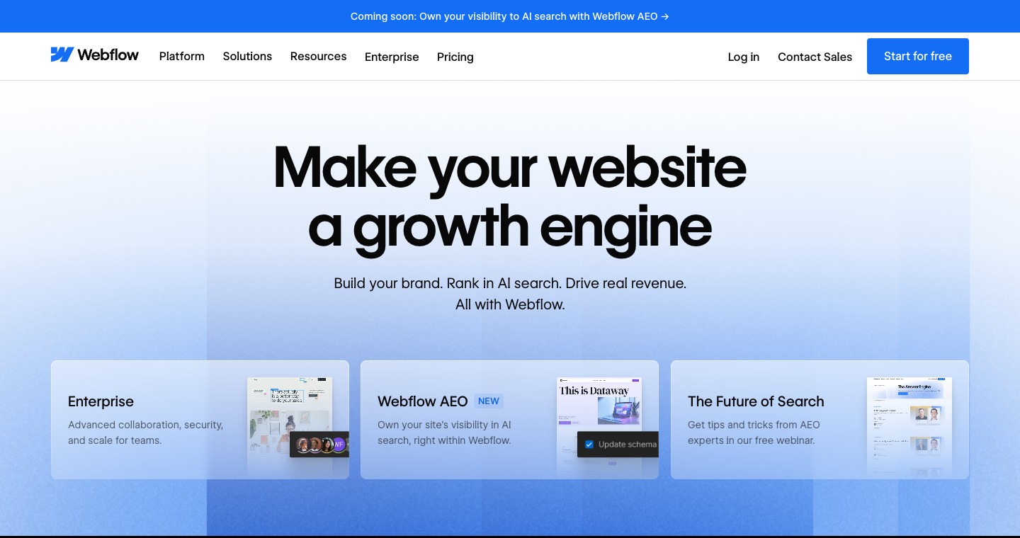
It is polished, modern, and commercially sensible. The headline is clear in a broad brand sense: Make your website a growth engine.
The problem is not quality.
The problem is sequencing.
Webflow introduces too many directions before the central trust argument has fully landed.
1. The headline is outcome-led, but the category is softer
Make your website a growth engine is a strong promise.
But it does not immediately tell the visitor what kind of product Webflow is in operational terms.
Is this a site builder? A CMS? An enterprise web platform? An optimization product? An AI search visibility tool? A brand system? A campaign launch layer?
The answer is yes to several of those.
That is exactly why the first screen needs sharper category control.
The more a product has expanded, the more disciplined the first sentence has to become.
2. The page adds promotional paths before the decision is settled
Below the hero copy, Webflow shows cards for Enterprise, Webflow AEO, and The Future of Search.
Each card may be useful.
Together, they ask the visitor to branch early.
A new visitor has not yet fully answered the first question: Why Webflow?
But the page is already asking follow-up questions:
- Are you enterprise?
- Do you care about AI search visibility?
- Do you want a future-of-search webinar?
Those are valid journeys. They are not all first-screen journeys.
3. The top announcement bar adds another story
The announcement bar says: Coming soon: Own your visibility to AI search with Webflow AEO.
That is timely and strategically relevant.
It also adds another frame before the hero has stabilized the main one.
The visitor now sees website growth, AI search, enterprise, AEO, webinars, contact sales, and start for free in one compressed surface.
None of those elements are individually wrong.
The combined effect is heavier than it needs to be.
4. The calls to action compete with content branching
Webflow's primary action is visible: Start for free.
But visibility is not the same as dominance.
The page surrounds that action with navigation, contact sales, login, announcement content, promotional cards, and product-path choices.
The visitor can click. The question is whether the page has made clicking feel inevitable.
Stripe does that better.
5. The page expands possibility faster than it reduces uncertainty
This is the central issue.
Webflow wants to communicate that it is no longer just a visual website builder. It is a broader website experience platform for growth, AI visibility, collaboration, enterprise control, and conversion.
That ambition is real.
But ambition needs pacing.
If the page introduces every growth argument at once, possibility becomes load.
The real difference
Stripe compresses trust.
Webflow expands possibility.
That is the whole teardown.
Stripe's first screen says: here is the category, here is the outcome, here is proof, here is the next step.
Webflow's first screen says: here is the outcome, here are several ways we can matter, here are multiple paths you may care about.
The second version creates more surface area. The first creates more momentum.
Homepage strategy is not about saying less for aesthetic reasons. It is about saying the right thing first so the rest of the product has a chance to be understood.
What I would change if I were Webflow
I would not strip the page down to a generic SaaS hero.
Webflow has earned the right to speak to enterprise teams, AI search, marketing velocity, design systems, CMS depth, localization, and optimization.
I would change the sequence.
The first screen should organize around one sentence:
Build, publish, and optimize your site without bottlenecks.
That sentence keeps the growth promise, but makes the operating category more legible.
It also gives the page a three-part ladder:
- Build: design and structure the site
- Publish: ship pages, content, and campaigns
- Optimize: improve performance after launch
That is easier to understand than presenting product breadth as separate promotional paths.
Then I would make four structural changes.
1. Move product branches below the first trust zone
Enterprise, AEO, and search content can stay.
They should appear after the visitor understands the core promise.
The first screen should sell Webflow as the website operating system. The second screen can route people into specific use cases.
2. Add proof before promotion
Webflow has strong credibility. The first screen should use it earlier.
Customer scale, enterprise readiness, governance, publishing speed, and brand control are all trust builders.
Lead with those before asking the visitor to choose between campaign cards.
3. Make the primary action feel like the natural next step
Start for free is a good action.
It needs more protection.
The first screen should make that action feel like the obvious continuation of the argument, not one option among many tiles and stories.
4. Treat AI search as an expansion, not the headline frame
AEO is strategically interesting.
But if AI search becomes the first frame, Webflow risks making the homepage feel like a campaign landing page instead of the front door to the product.
The better sequence is: Webflow helps teams run the website growth engine. AI search visibility is one important part of that system.
The rebuilt page
The mockup should not stay theoretical, so I turned the critique into a live page.
Open the rebuilt page on its own.
Why this matters beyond Webflow
This is not really a post about Webflow.
It is a post about what happens when successful products grow beyond their original category.
The homepage starts carrying too many internal truths:
- the original product
- the enterprise motion
- the new AI story
- the campaign calendar
- the newest feature bets
- the conversion goal
Every team has a good reason to be above the fold.
That is how strong companies end up with expensive first screens.
The page is not wrong. It is overburdened.
A homepage hero has one job before every other job: create enough trust for the next click.
Stripe does that by compressing category, proof, and action into one decision zone.
Webflow can do it by sequencing its breadth instead of presenting it all at once.
Trust first.
Branching second.
That is the difference.