Challenge
Food founders need proof that an identity can survive the counter, the phone screen, and the menu board. A single logo does not prove that.

Self initiated restaurant concept
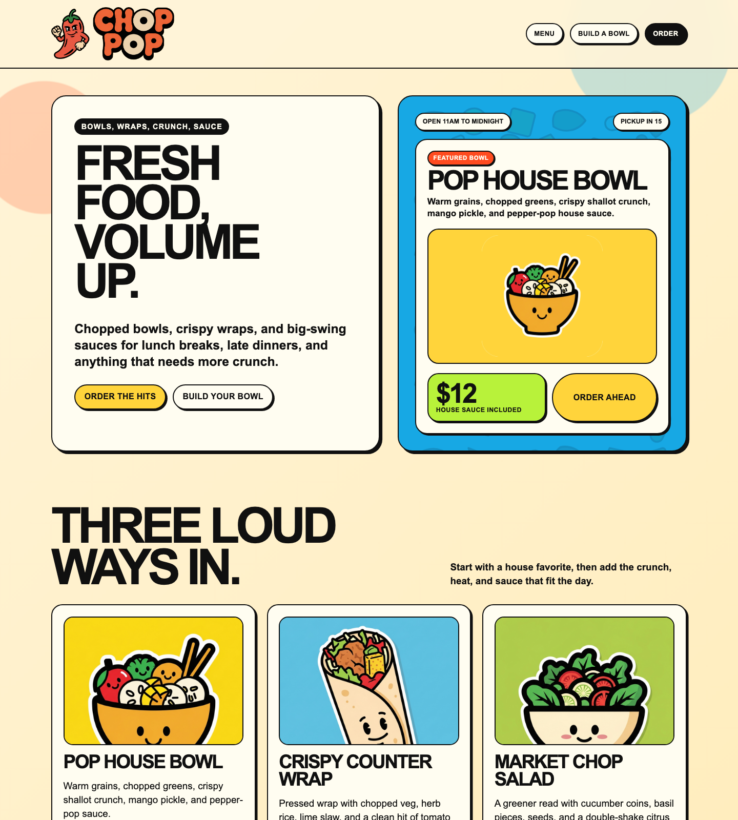
A sauce first bowl and wrap counter built by Mega City to prove a complete food brand can move from strategy to identity to a coded digital surface without losing appetite or clarity.
Disclosure: Chop Pop is a self initiated concept project by Mega City. It was not commissioned by a restaurant, and no customer data, sales result, client relationship, or operating business is implied.
Food founders need proof that an identity can survive the counter, the phone screen, and the menu board. A single logo does not prove that.
We built the concept around loud fresh energy: chopped ingredient shapes, punchy sauce language, collectible marks, and a strict one dominant color per touchpoint rule.
The final system includes a mascot backed wordmark, confetti language, food illustration style, restaurant copy, and a responsive demo site that feels like a real ordering surface.
Chop Pop gives Mega City a brighter proof piece: brand, copy, and code working together with honest spec framing and no borrowed client credibility.
Digital surface
The demo page was rewritten as a customer facing Chop Pop site: hours, featured bowl, order ahead language, menu cards, sauce builder, app prompt, and footer. The concept disclosure stays in the Mega City case study, not inside the restaurant experience.
That split matters. Buyers see both sides: the fictional brand as a usable product surface and Mega City as the honest author of the work.
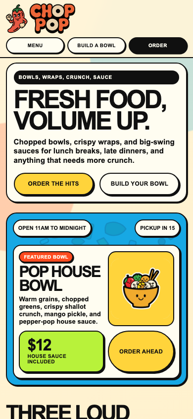
Responsive
The hero, featured bowl, menu, and app sections were tuned at desktop, tablet, 390px, and 360px widths to keep the energy loud without breaking the frame.
Chop Pop adds a commercial food world to the calmer Astra House and darker Vesper proof pieces, showing that Mega City can shift tone without losing discipline.
The writing is appetite led and practical: fresh bowls, crispy wraps, sauce labels, pickup timing, and ordering prompts that sound like the brand belongs on the street.
The finished demo gives prospects a live artifact to judge, not a static image. It shows craft in structure, spacing, performance minded assets, and responsive behavior.
Why it matters
Chop Pop is not client work. That is the point. It shows the level of thinking, taste, writing, and front end execution Mega City can bring before a client spends a dollar.